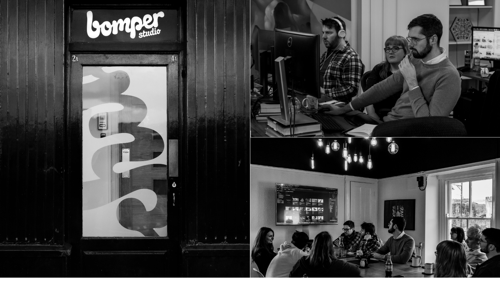
About Bomper Studio
Bomper Studio is an independent creative production studio based in Caerphilly. The in-house team of artists, illustrators, animators, art directors and producers work across advertising, branding, broadcast, VFX, animation, CGI and still images. Bomper’s clients include BBC, Levi’s, RCA and Tesco.
When we’d worked with retailers in the past, their configurators were very linear and wasteful.
If we could find a way to make a real-time configurator, we could improve user experiences, cut waste created by unnecessary photography and streamline the pipeline. To explain: imagine a client wanted a configurator with 20 objects in it, each with 20 material choices. To make it work, we would take thousands of photographs of the products and material choices from every angle. This is so that the configurator could piece them together into an accurate depiction of what the finished object may look like, according to the user’s choices.
Over time, the client would add more objects and materials. Before you know it, the image bank gets exponentially bigger. For one client in the past, we made 46,000 images for the configurator on their website! The crazy thing is that around 15% of images on these linear configurators will never get seen, simply because nobody selects the specific configurations needed to bring the images up. This means we end up doing a lot of work upfront, using the client’s budget to render images that probably won’t be seen. That just didn’t make sense to us.
We received funding from Clwstwr to make a prototype.
The first consideration for us was about how we’d like the configurator to sit in context. We wanted to give the configurator some kind of narrative, so that you could click an online advert that takes you straight to the configurator. We also wanted to make sure there was continuity between the advert and the configurator, something which we felt we’d be able to do by using similar styling in both places.
Leaning on experts helped us fill our skills gaps.
We knew how to make CGI objects look pretty, but we didn't understand how to make a configurator join up with an advert on somewhere like Facebook or Instagram. So, we called in a web developer with experience of using Unity, a real-time platform, to focus on that for us. We later used an in-house artist and a freelancer with a gaming background to help us reduce our image file sizes.
We needed to make the models as small as possible for minimal latency.
We’d decided that we wanted customers to view the configurator on their browser, rather than on a separate app. But, this meant that if the image file sizes were too large, customers would have to wait for the configurator to load - which could lead to them clicking off and not making a purchase. There was this really fine balance between getting these models looking realistic and as good as possible while trying to keep them as small files.
To save time and money, we pared back our ambitions halfway through.
When we started building, we were going to go all out and push for interactive environments that you could swap out. However, we realised there were more important things to focus on, such as making sure users could select different objects and change materials. So, to save time and money, we bought in some environments that we could drop into the configurator for testing purposes, which was cheaper and quicker than building our own from scratch. The majority of the rest of our money went on getting our assets into the built environments and paying freelancers and consultants.
We thought we had a viable product, but there’s some tweaking left to do yet.
We planned to make a working prototype, which we achieved. However, there are still things we’d like to change in order to feel like the prototype is ready and finished. There are possibly better ways to host it; currently you’d host it on a website, then customers would have to wait for about 20 seconds while all the objects download to use it. We now realise it’d be better to host it in the cloud so that customers could stream pixels from a server rather than having to download models.
We would also like to try and change it over to Unreal Engine, for longevity and because they’re constantly developing it. Some of the luxury brands that we’ve seen using configurators have built them on Unreal and Unity, so it makes sense. All of these tweaks can come in the next phase of R&D we do; it’s all about learning stuff as you go along.
Once the configurator is ready to launch, we have a few directions we can take it in
We're looking at the best way forward. We could licence it, we could potentially sell it as a full package or service, or there are other options besides these. It might be that we reach out to a big retailer, get them on board and use them as a potential guinea pig. We still don’t know much about how the backend of the configurator works because each retailer’s website is different, so that’ll be something to get our heads around. There will always be things to do to make the configurator as good as possible, but that’s part of the fun of research and development.

